The challenge
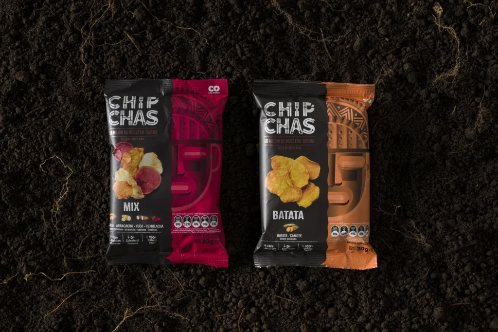
To design a coherent and impactful graphic system that elevates ChipChas’ packaging to the next level—effectively communicating its origin, attributes, and delicious flavor to engage audiences. The new design needed to establish a solid brand architecture, allowing for future product expansions and potential entry into international markets.
What we did
ChipChas faced the major challenge of standing out in the highly competitive snack market while ensuring its ancestral roots and product story remained at the forefront.
To achieve this, we designed more than just packaging—we created a structured graphic system and brand architecture, ensuring a clear vision for the brand’s future. This approach allows new product references and even entire product lines to be developed seamlessly and consistently.
Research
The most critical aspect of the inspiration phase was identifying and understanding our target audience, whom we called the “fit but fat” consumer—those who value health and nutrition but refuse to compromise on flavor.
We conducted in-depth research to understand what truly matters to them and assessed their perception of ChipChas’ existing packaging. A key insight emerged: while consumers connected with the product’s taste and ingredients, the packaging failed to evoke the right emotions.
We also analyzed national and international brands that successfully blend wellness and indulgence, as well as those that engage consumers through powerful storytelling.
Concept development
Working closely with the client, we defined must-have and must-avoid elements for the new design.
Key takeaways included:
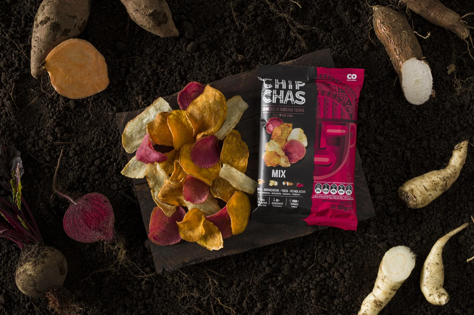
Black as a dominant color to make the product’s natural colors stand out.
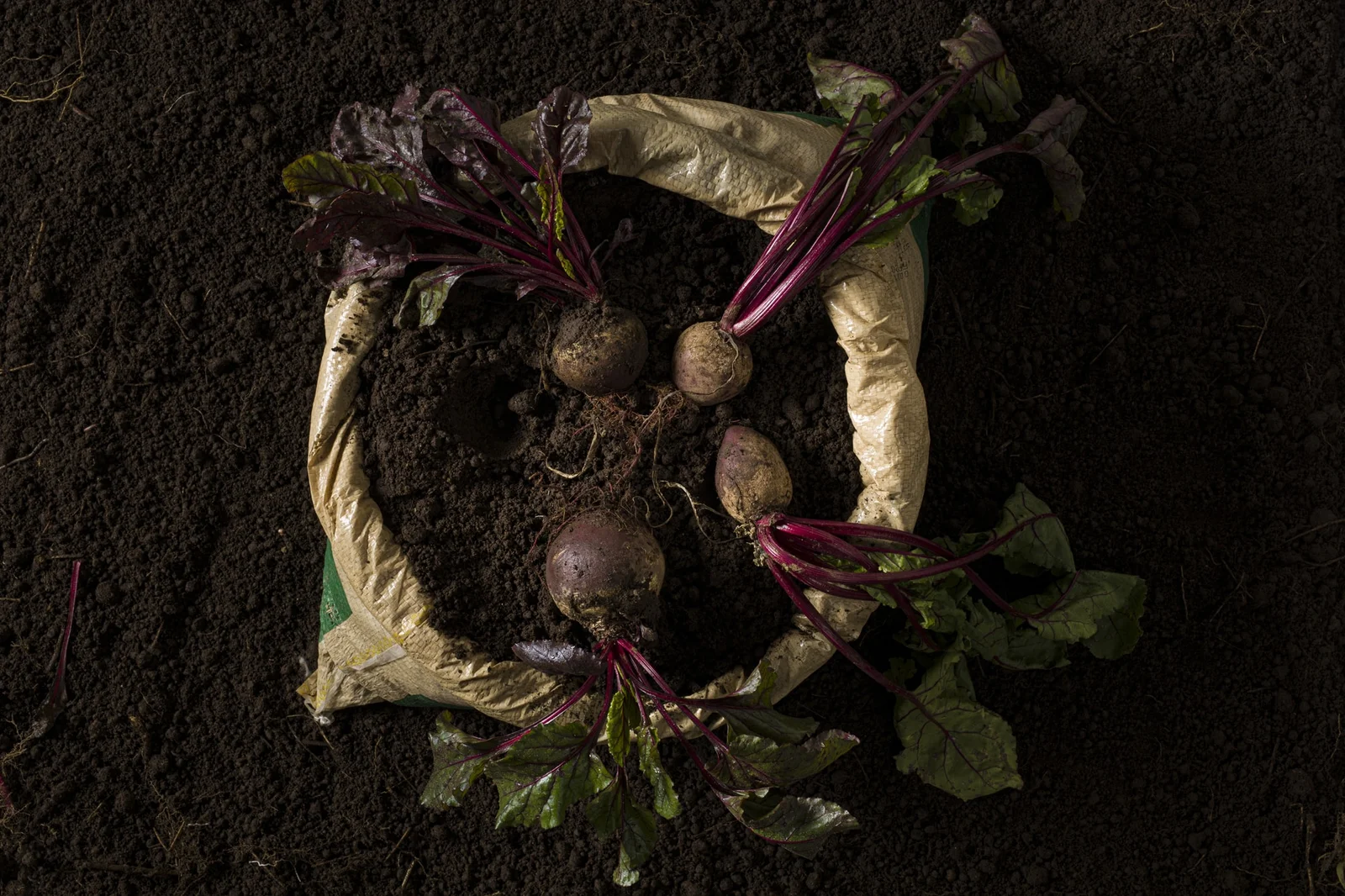
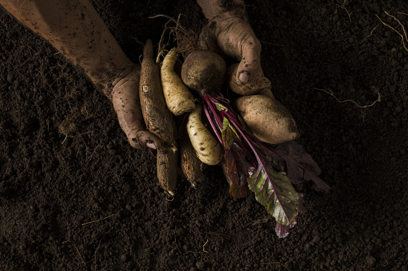
The story of origin must be visible and central to the brand’s messaging.
Non-negotiable elements:
Color blocks to differentiate product varieties.
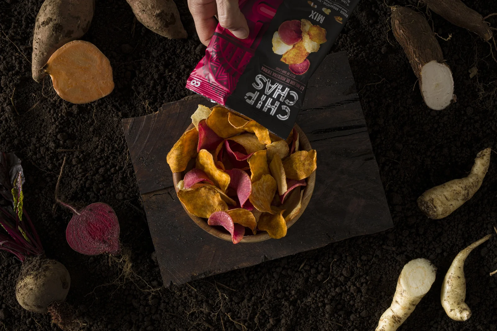
High-quality photography that enhances appetite appeal and sensory attraction.
The design team ultimately embraced ancestral power as the core concept, drawing inspiration from Chibcha culture to create a strikingly unique visual identity unlike anything currently seen in the snack industry.
The outcome
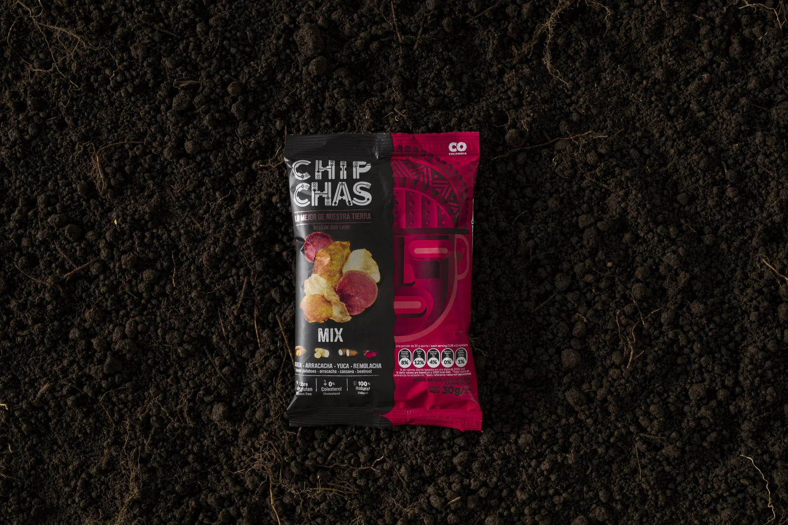
We developed a packaging and brand system centered on the importance of masks in Chibcha culture, giving them a prominent role through detailed illustrations that use light and shadow effects to create a three-dimensional look.
The redesigned packaging, implemented by the client in 2019, was awarded Gold in the Best Food Packaging Category at Latampack in February 2020.
