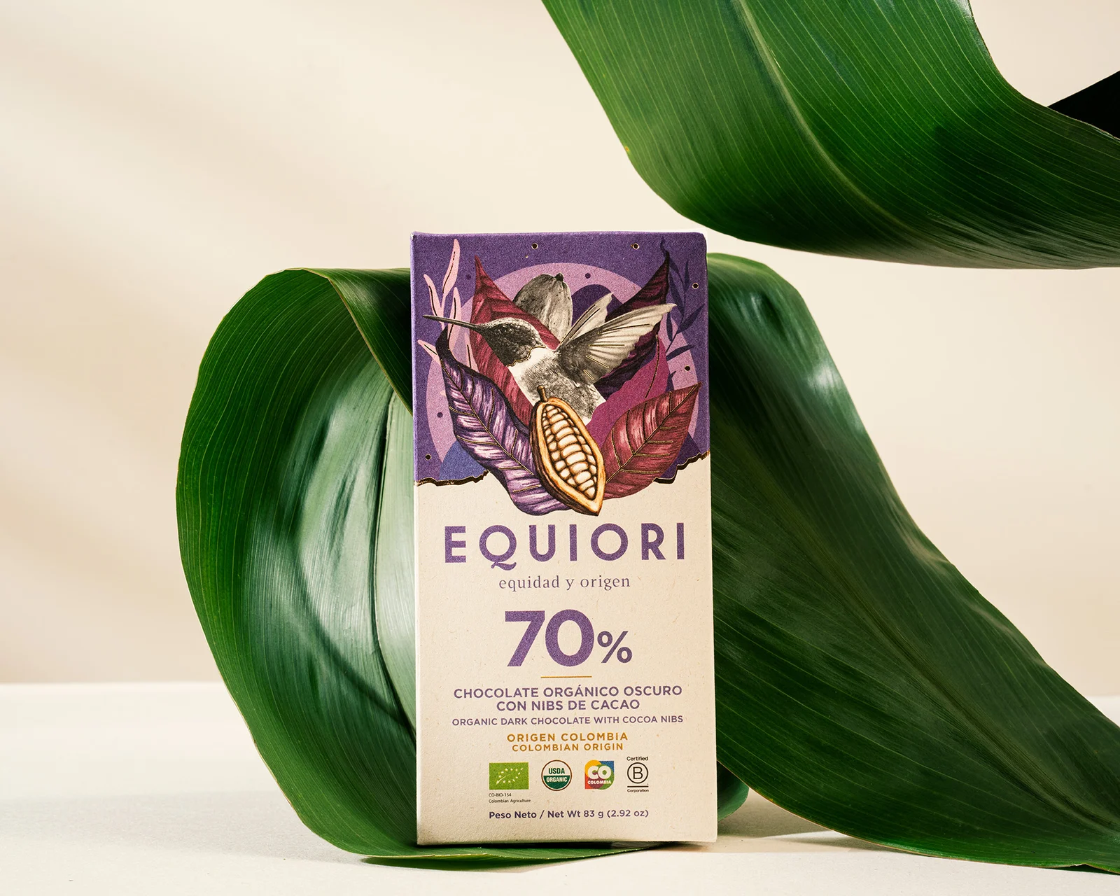
The challenge
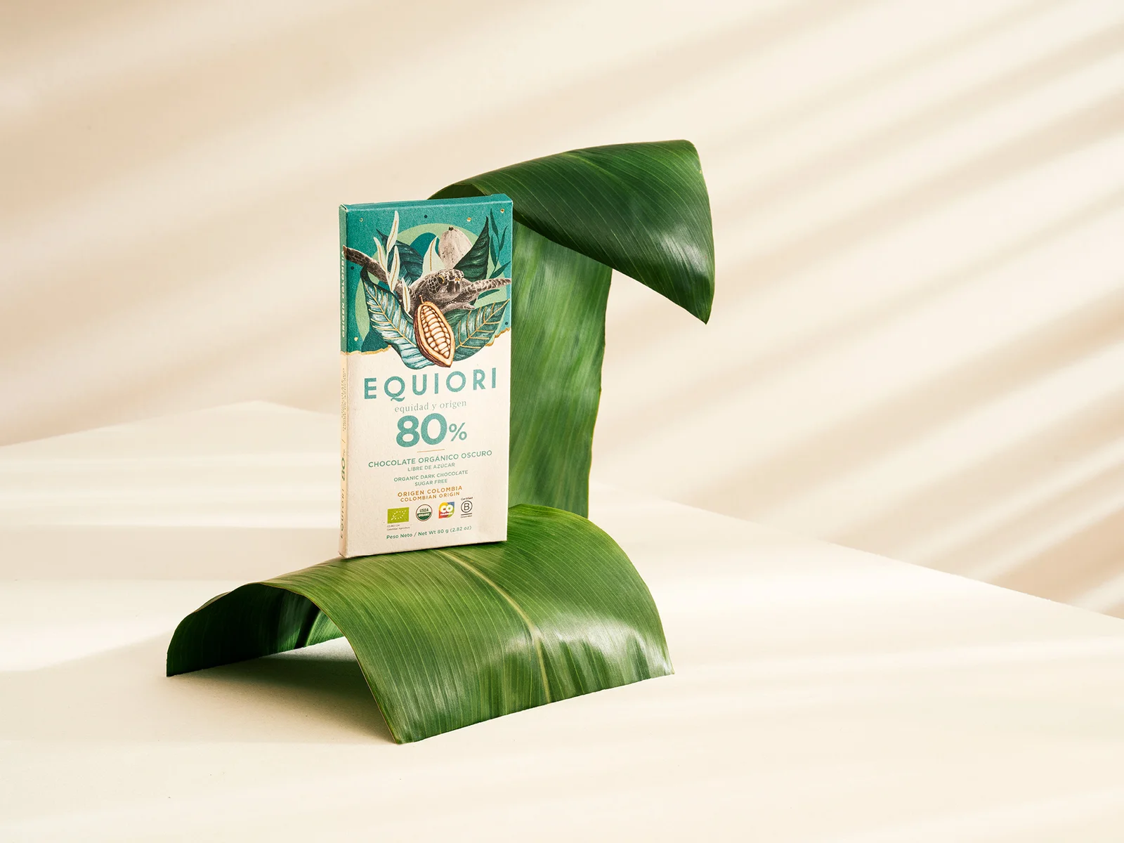
With the chocolate category growing in Colombia, Equiori sought to revamp its packaging system to better express its brand purpose in a distinctive way, while also highlighting its origin through design.
What we did
The design process began with a research and inspiration phase aimed at understanding the chocolate category. We analyzed local and global chocolate brands to identify key category elements and uncover opportunities for differentiation.
Additionally, we drew inspiration from categories beyond chocolate, such as coffee and spirits, where the origin of raw materials is frequently emphasized. This approach led us to use Colombia’s biodiversity as the core element of the design system.
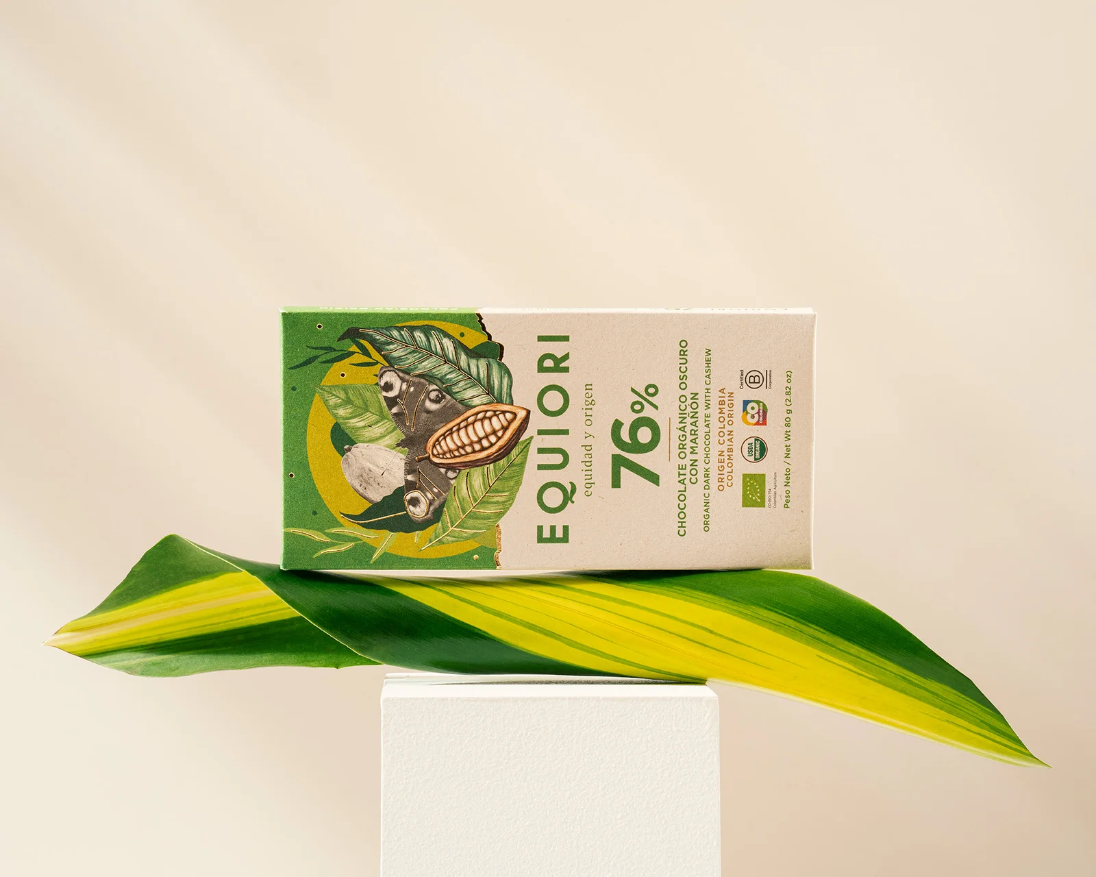
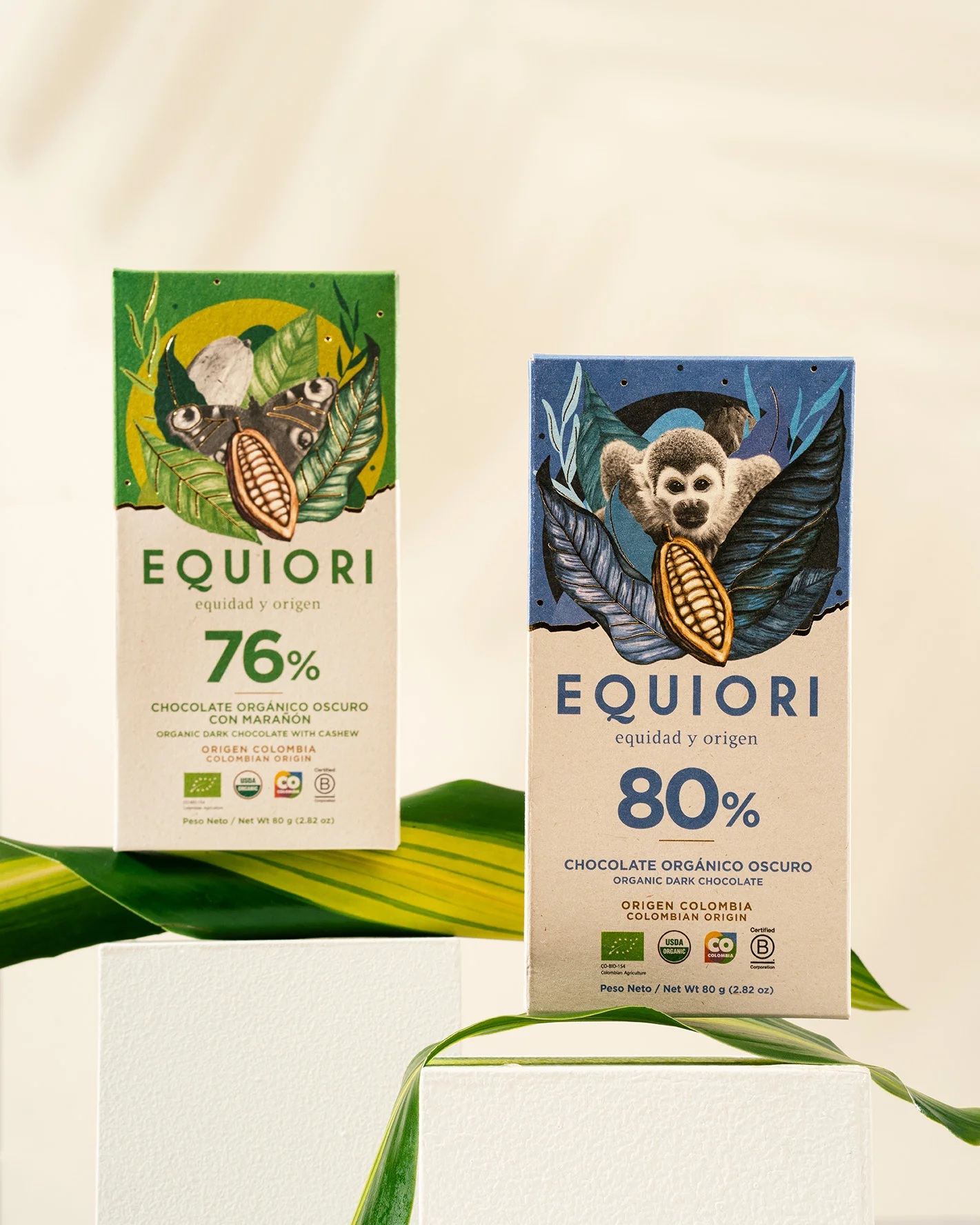
The outcome
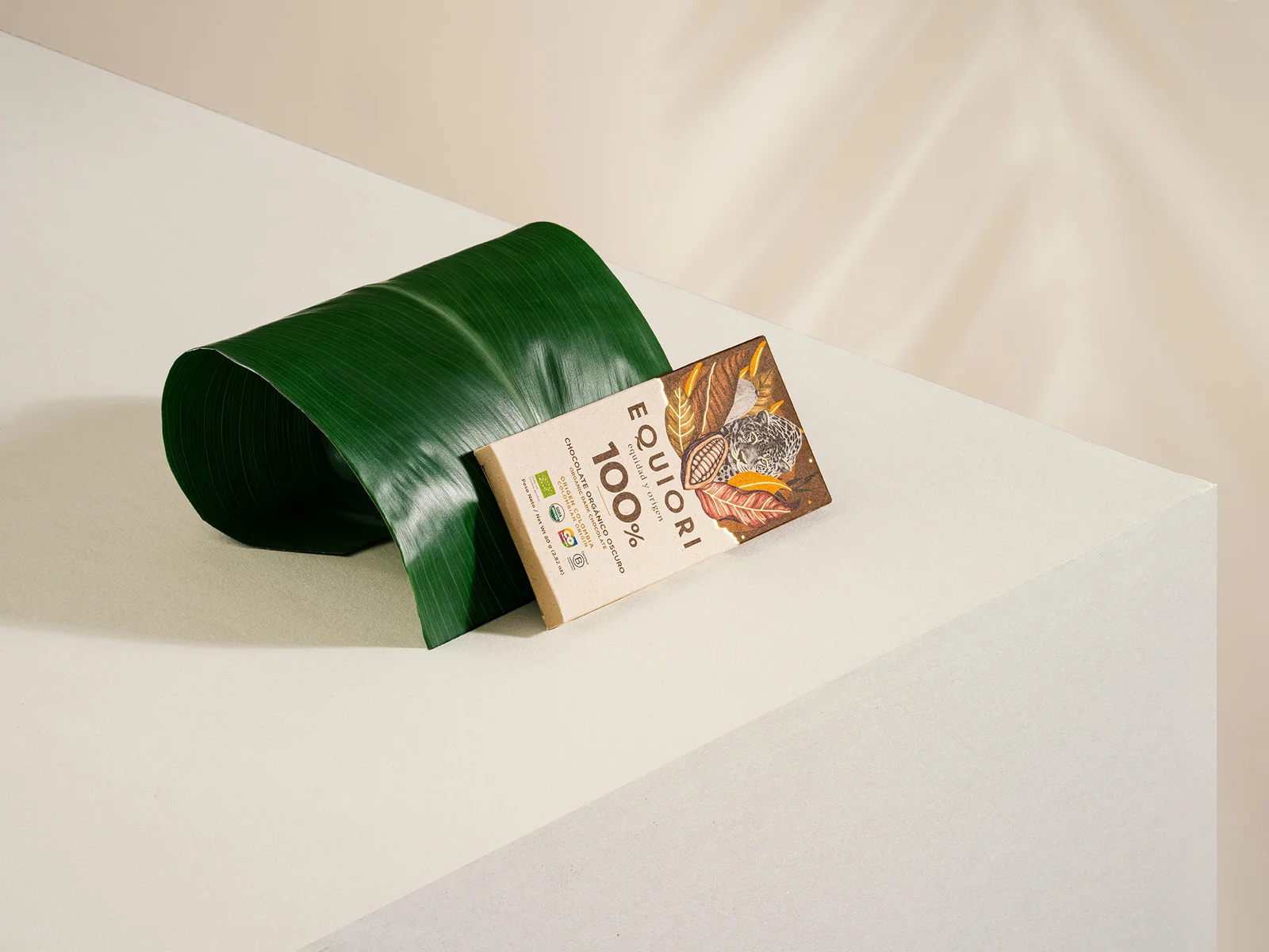
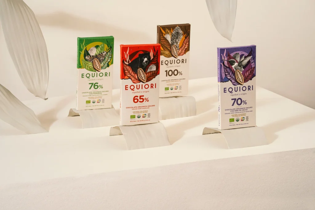
The packaging design proposal features photographs of Colombia’s representative fauna as the central visual element. These images are complemented by illustrations evoking nature, including plants, cacao, and mountains, arranged in collage-style compositions for each chocolate bar.
The graphic system we developed provides flexibility for the brand, offering a diverse set of visual resources that enhance its communication strategy. This ensures that Equiori can consistently convey its purpose, impact, and value proposition across all touchpoints in a unique and cohesive way.
Research: Carolina Ríos
Design: Sandra Mora
Photography: Espacio Crudo
Creative Direction: David Freyre
