The challenge
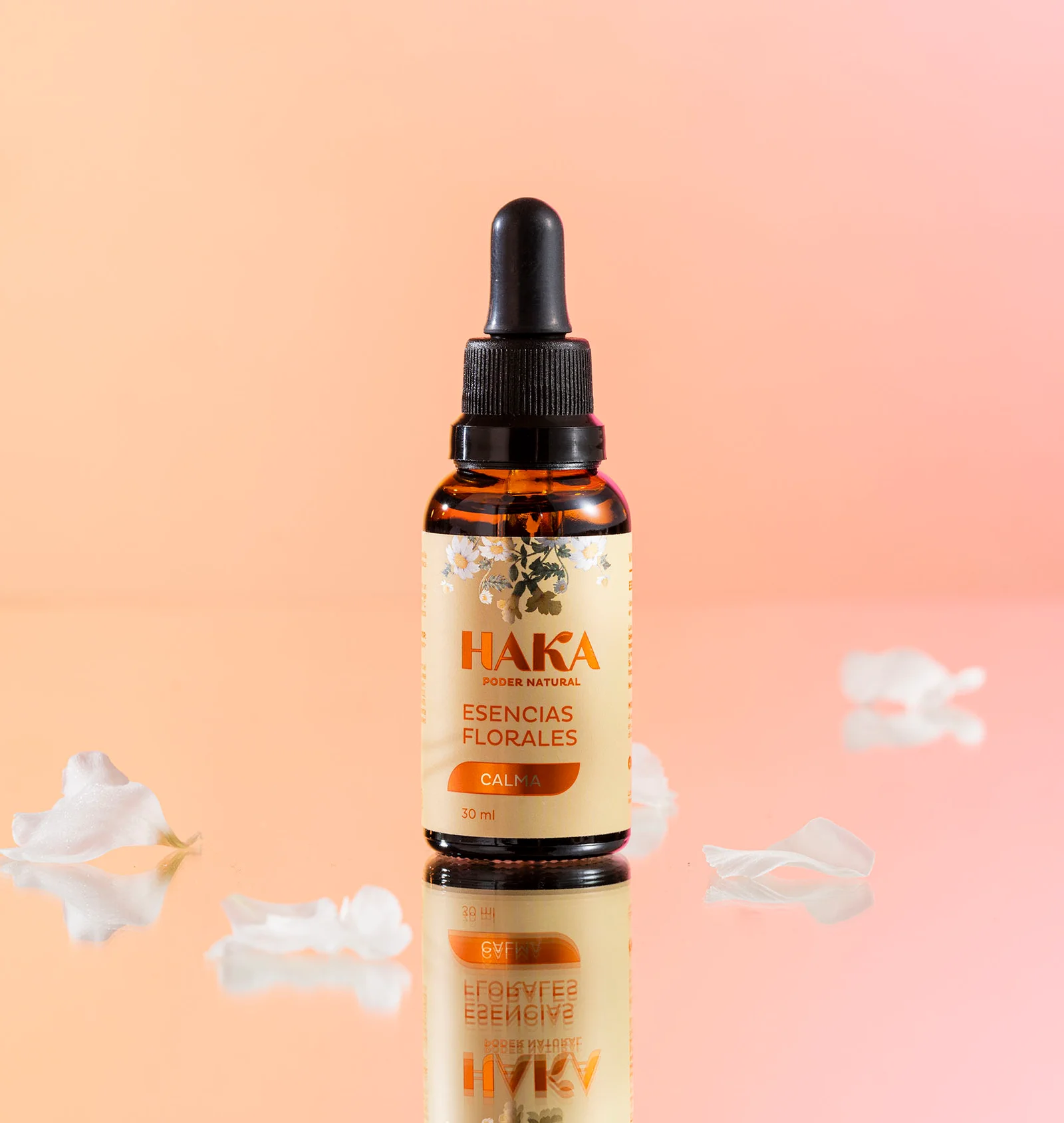
To develop the visual identity and packaging system for Haka, a brand that merges ancestral wisdom with scientific knowledge to harness the healing properties of nature and create products that promote health and well-being.
What we did
The research process began with an observation of sales channels and an identification of the user profile through interviews with individuals selected for their experience and expertise in the field. This allowed us to gather firsthand insights and deeply understand the target audience.
Next, we conducted a brand architecture study of existing market competitors, both within and beyond the category. We analyzed key characteristics such as packaging, ingredients, tone of communication, color schemes, and other visual resources that aid in navigating large product portfolios. This step was essential in understanding the world of phytotherapy, differentiating Haka’s identity, and ensuring product shopability.
Finally, during the design exploration phase, we developed various proposals that expressed ancestral wisdom, scientific knowledge, and the natural botanical essence central to the category.

The outcome
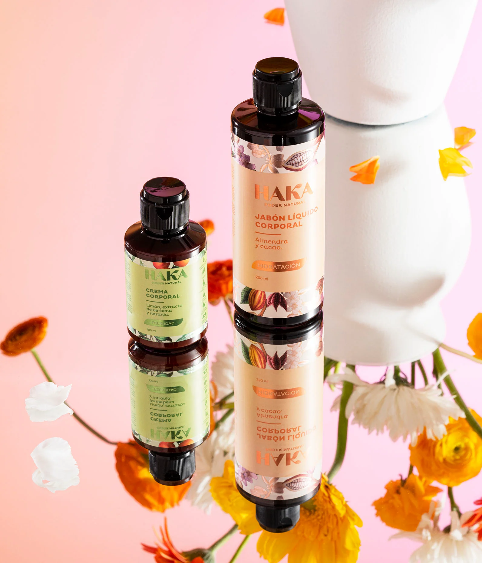
Through a co-creation process, we developed a packaging system that conveys a natural, healthy, and conscious lifestyle. The elegant and clean graphic identity clearly and honestly highlights the ingredients and benefits of each product.
The use of color and realistic botanical illustrations serve as the brand’s key visual elements, emphasizing the power of each ingredient. Today, Haka has an extensive product portfolio that, thanks to its coherent and consistent identity, effectively communicates its value proposition.
Design: Sandra Mora, Felipe Cardona
Research: María Clara Henao, Carolina Ríos
Final Artwork: Byron Ospina
Photography: Espacio Crudo
Creative Direction: David Freyre

