Kaime is a plant-based brand dedicated to producing foods that promote a conscious lifestyle and respect for the environment.
Packaging Architecture, Packaging Design
Context
Today, through a restaurant recognized for the quality of its dishes, Kaime fulfills its mission of proving that plant-based food can be both delicious and accessible to everyone. Facing the challenge of entering mass-market sales channels like supermarkets, Kaime needed to design a packaging architecture for multiple categories—one that would reflect its brand identity while remaining visually appealing and competitive in a saturated market.
The challenge
To redesign Kaime Foods’ packaging system in a way that allows the brand, which currently exists in a restaurant setting, to establish an attractive and distinct presence in retail. The goal was to reflect its identity through a coherent and consistent architecture that enables navigation across multiple food categories.
Inspiration
We conducted research focused on understanding how other restaurant brands, both locally and globally, have successfully transitioned their products to retail without losing their essence. Additionally, we analyzed the competitive landscape of plant-based brands to identify visual and communication strategies for product claims and benefits.
We also examined the key visual codes of each category and how brands that operate across multiple food categories create a consistent yet flexible and adaptable architecture—ensuring strong shoppability while enhancing the consumer purchase experience.
Development & Outcome
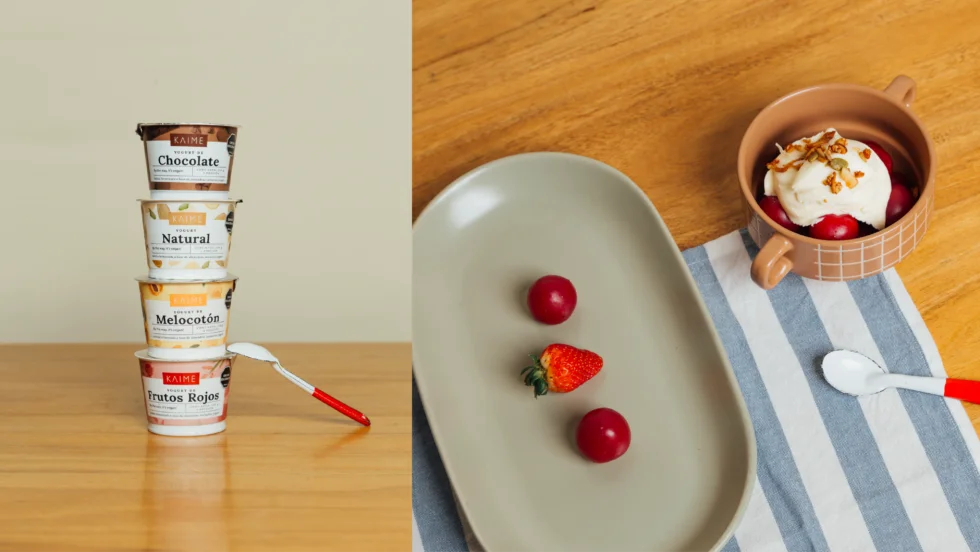
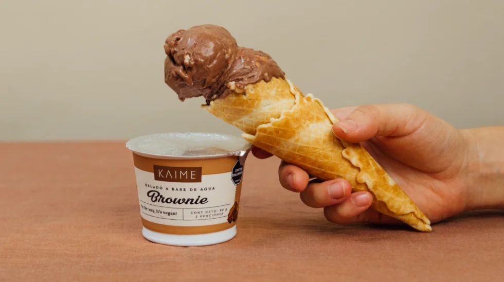
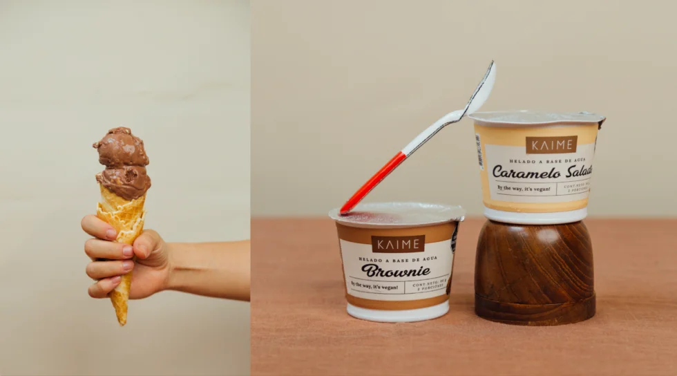
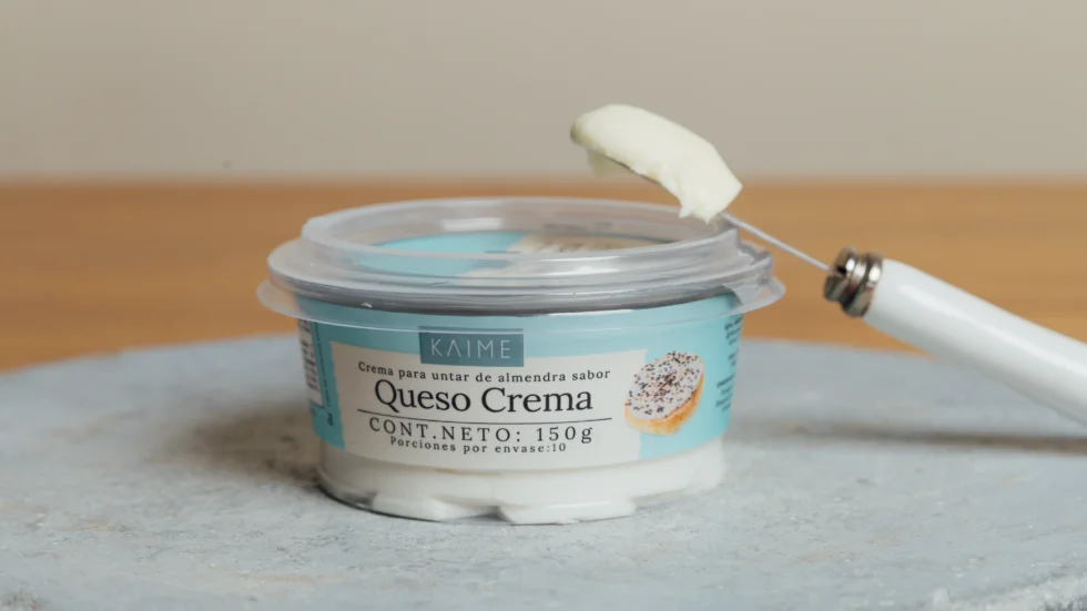
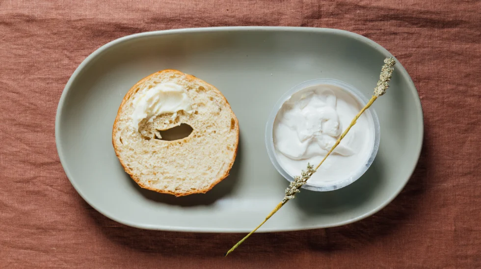
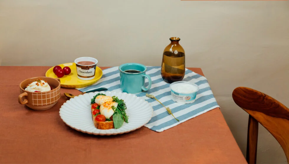
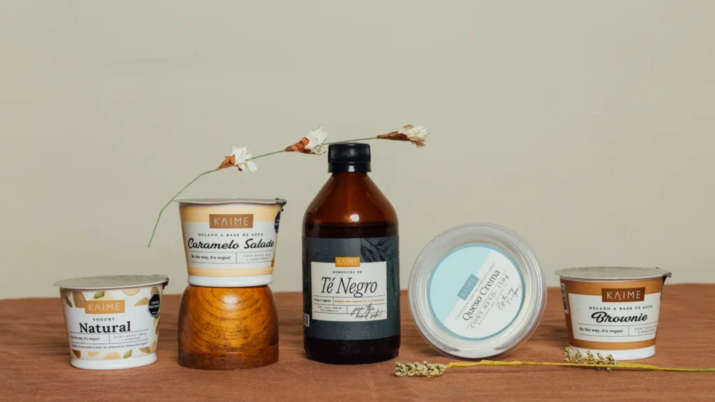
As a result of this challenge, we designed a packaging system based on pastel colors to maintain the simplicity of the brand and the calm essence inspired by the sea—an integral part of the restaurant’s personality. We also developed a series of handwritten phrases that highlight the vegan nature of the product without overshadowing other key design elements.
For each product category, we created graphic elements that complement the visual system, including diverse illustration styles and indulgent photography. These elements are arranged on the packaging alongside a central panel that displays the product’s key information.
Additionally, we carefully selected typography for product descriptors to ensure adaptability across different categories. This approach allows the brand to maintain flexibility in its graphic system, supporting future portfolio expansion while preserving visual consistency.