The challenge
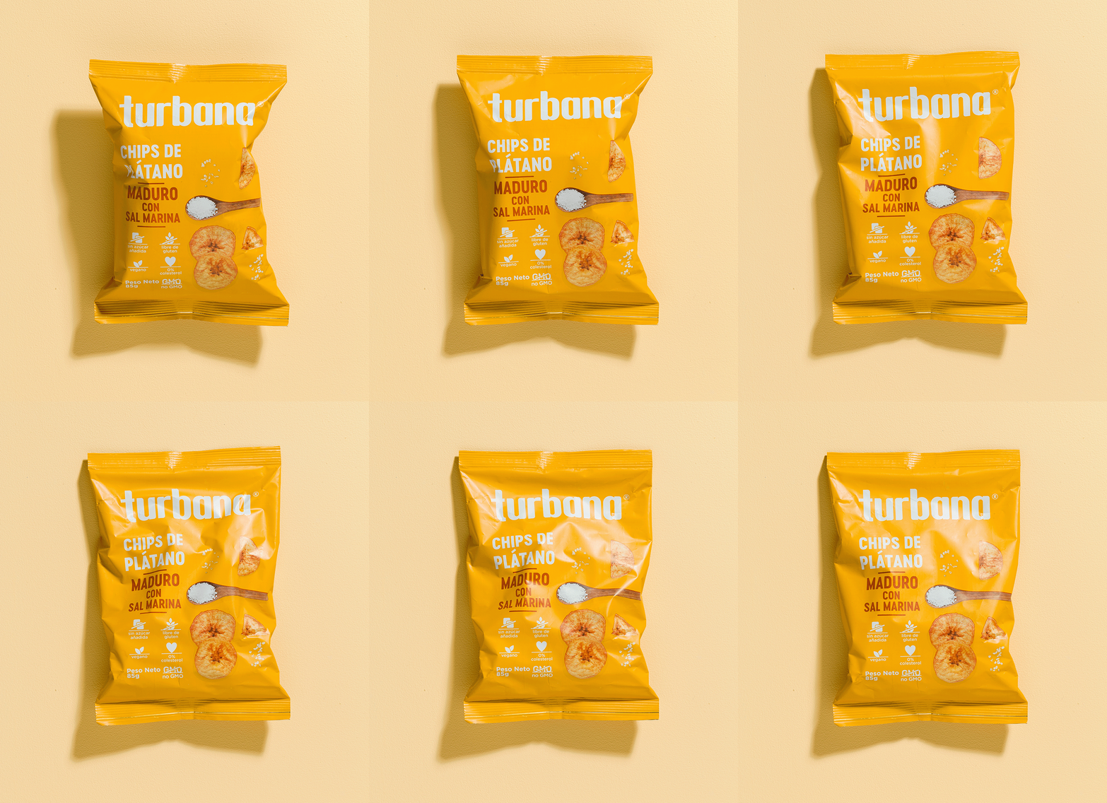
We designed a graphic system to elevate and evolve the Turbana brand. Competing in highly competitive markets across Latin America, the U.S., and Europe, Turbana needed to stand out and communicate its value proposition in a clear and relevant way, aligning with shifting global consumption trends.
What we did
We conducted research on global snack trends to identify unique elements within the category, ensuring differentiation while maintaining familiarity with existing market language.
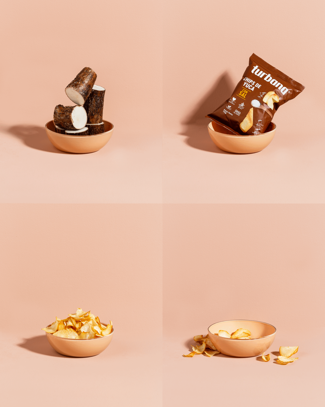
We found that highlighting the ingredient—whether through photography or illustration—was a key strategy. This insight inspired the brand’s new visual direction, aimed at consistently and impactfully showcasing its flavor diversity.
The outcome
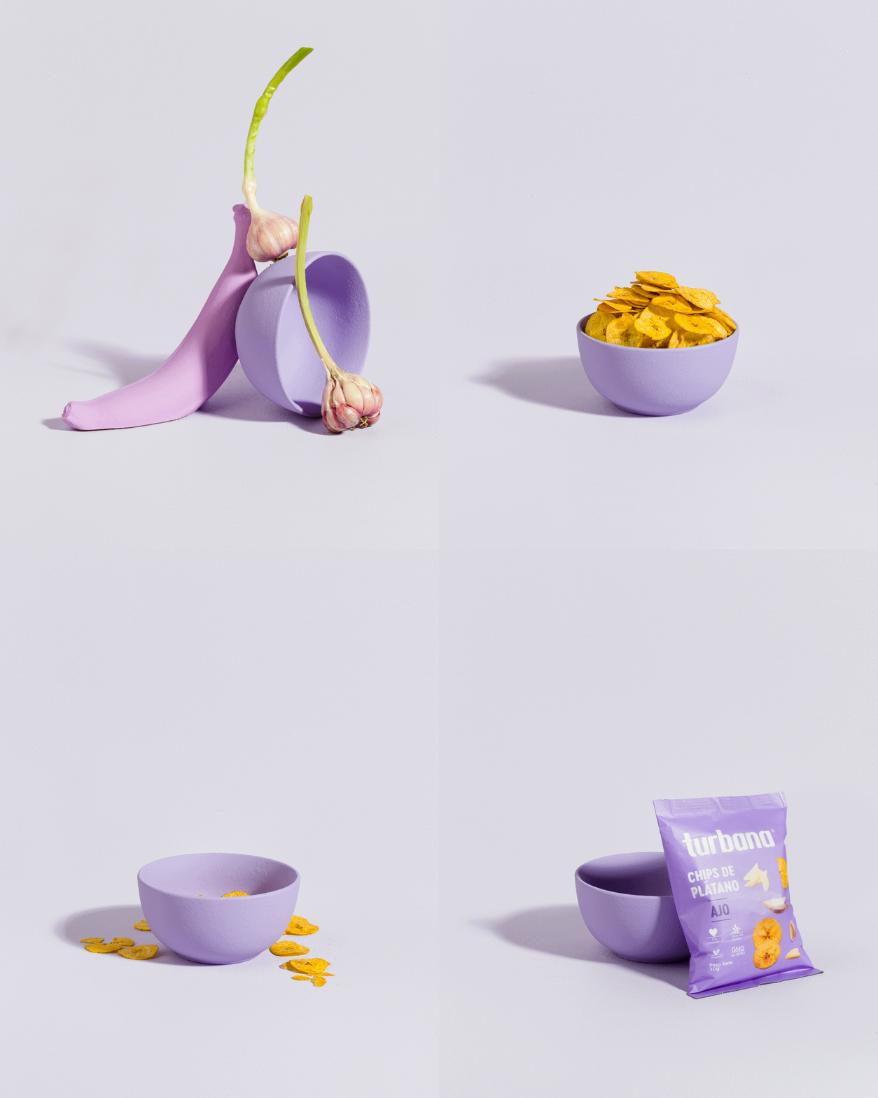
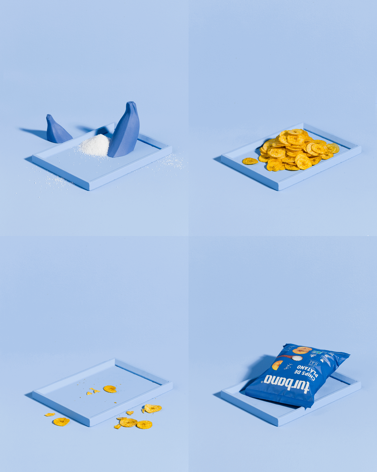
We developed a brand strategy that simplifies the way Turbana’s ingredients are presented, drawing inspiration from museum exhibitions, where components are broken down and displayed individually and in detail. This approach effectively communicates the natural quality of the products, emphasizing their simple and clean ingredient list.
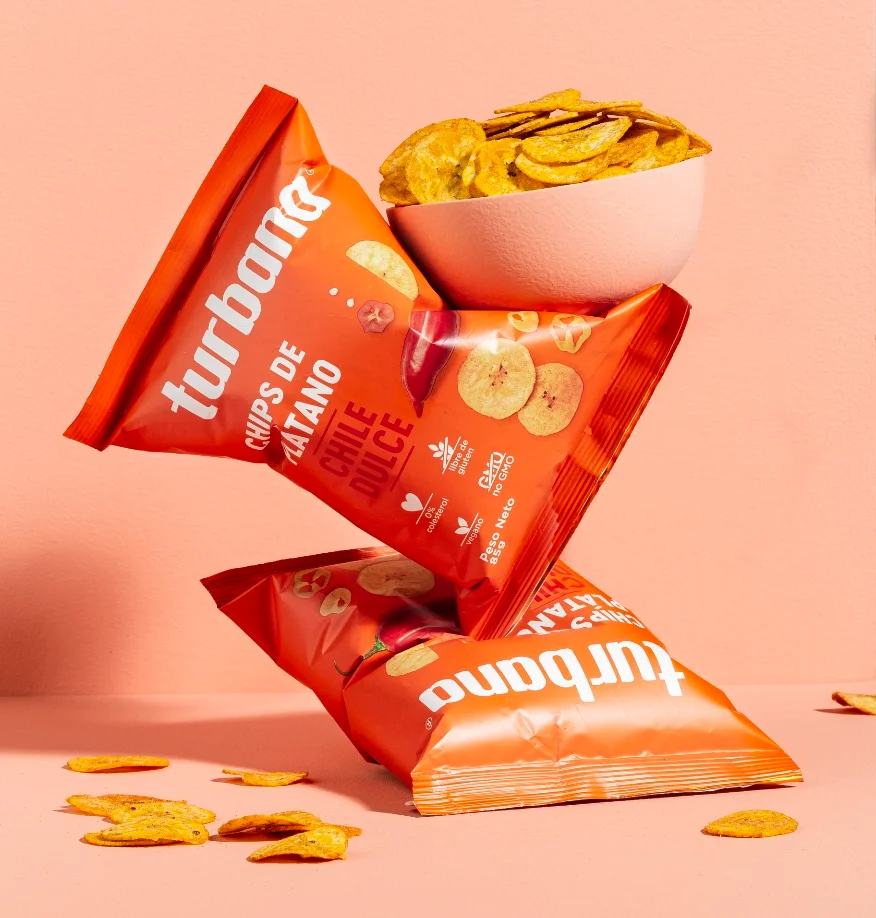
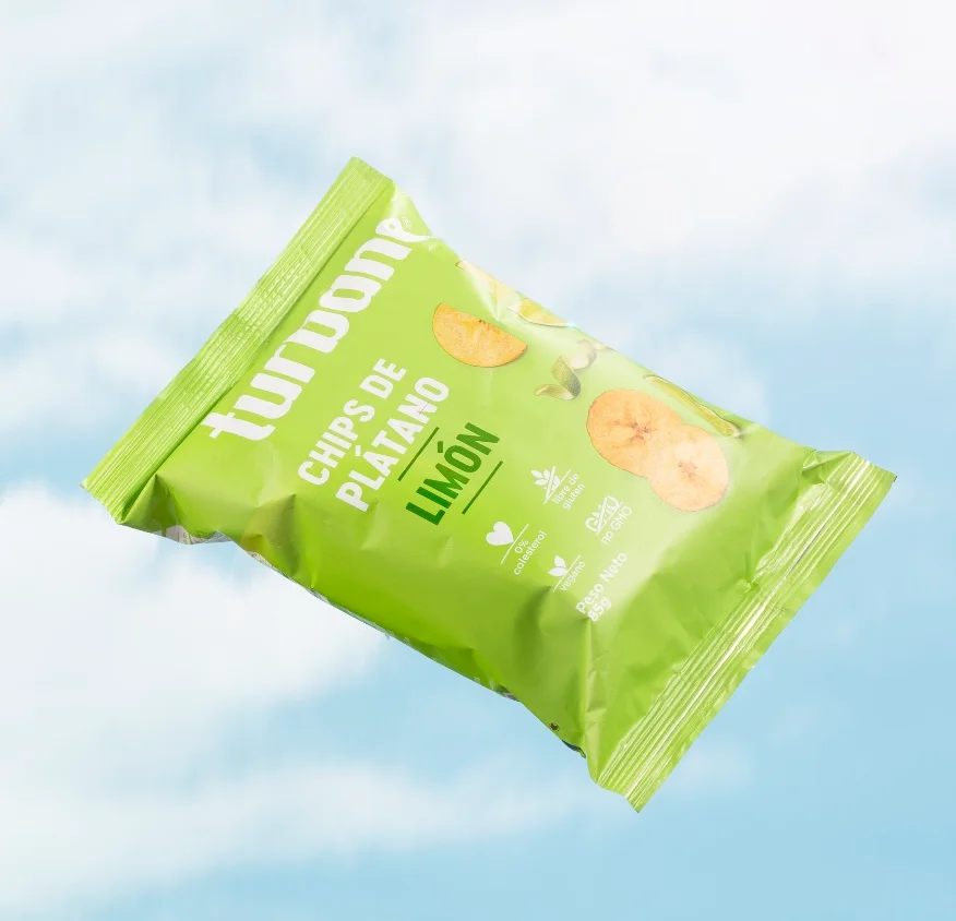
Leveraging the endless possibilities of color, we assigned a distinct hue to each Turbana flavor combination, creating a strong visual impact and clear differentiation within the category.
Finally, we simplified the brand’s logo, removing colors and unnecessary containers, embracing a minimalist design that aligns with emerging industry trends and strengthens its presence in the market.
Research: Camila Arango
Design: Sandra Mora, Felipe Cardona
Creative Direction: David Freyre
Photography: Espacio Crudo

