The challenge
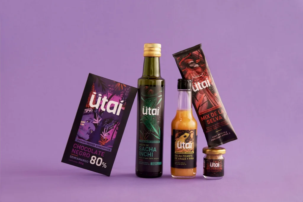
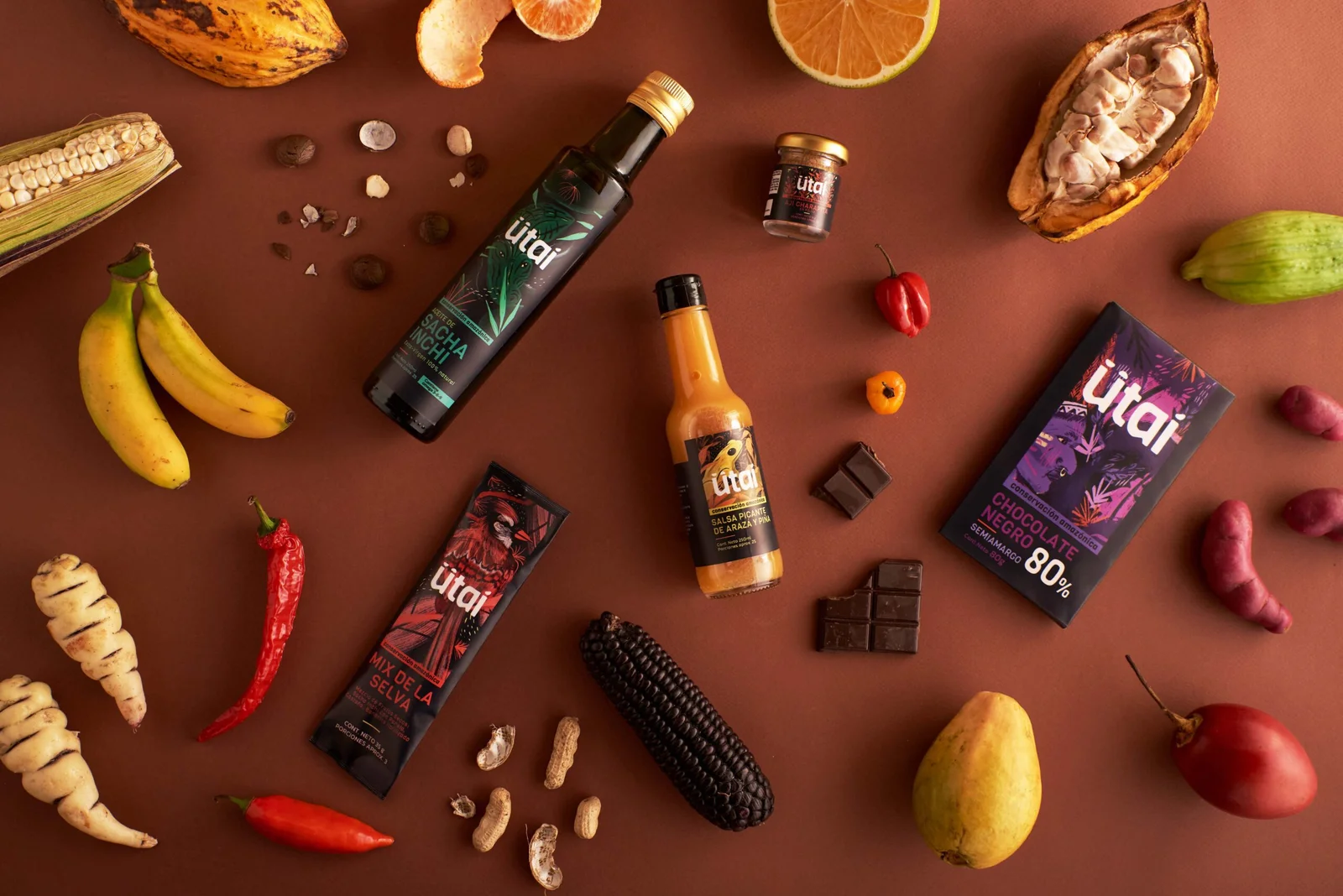
To design a visual identity and packaging system for a broad portfolio of products cultivated in the Colombian Amazon. The goal was to highlight the brand’s social and environmental purpose, using its origins as a key differentiator in the market.
What we did
The design process began with a research and inspiration phase to understand the category. We analyzed local and global snack brands to explore the different ways brands communicate their origin effectively.
Next, we conducted a series of workshops in collaboration with the Agrosolidaria team, where we defined the brand name, strategy, and personality.
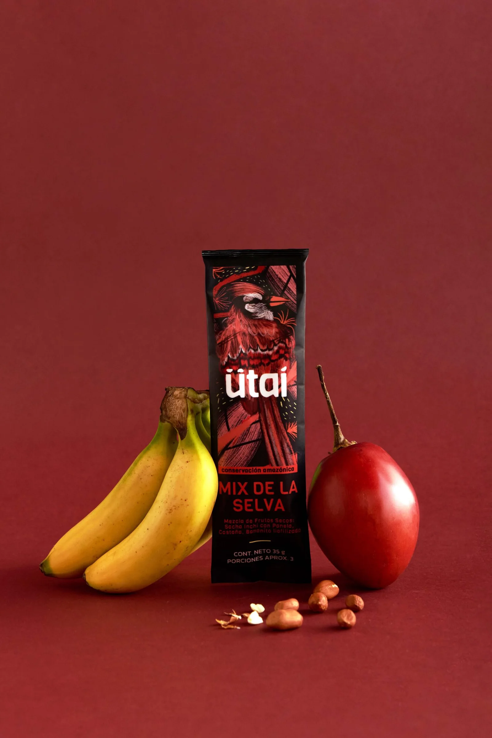
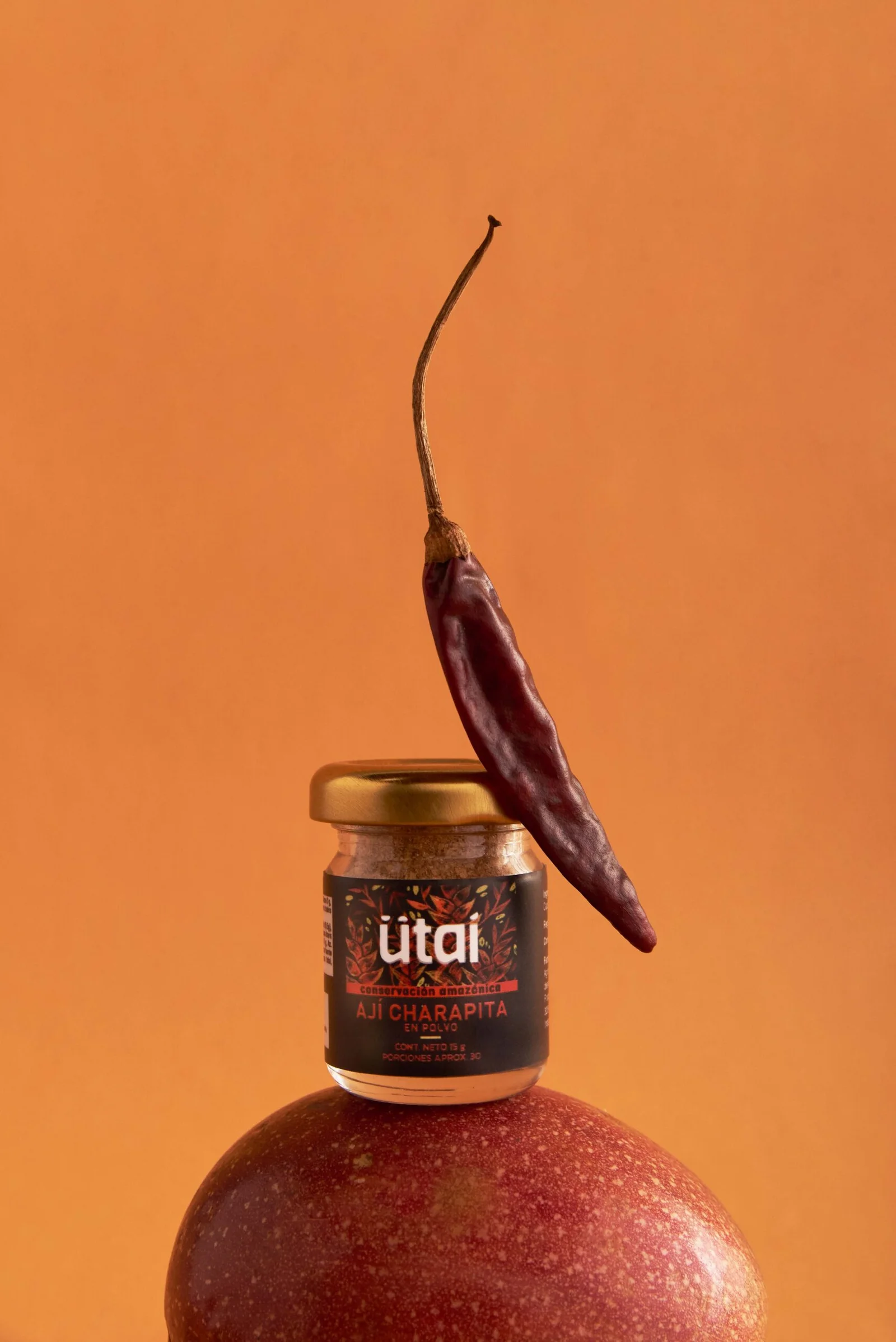
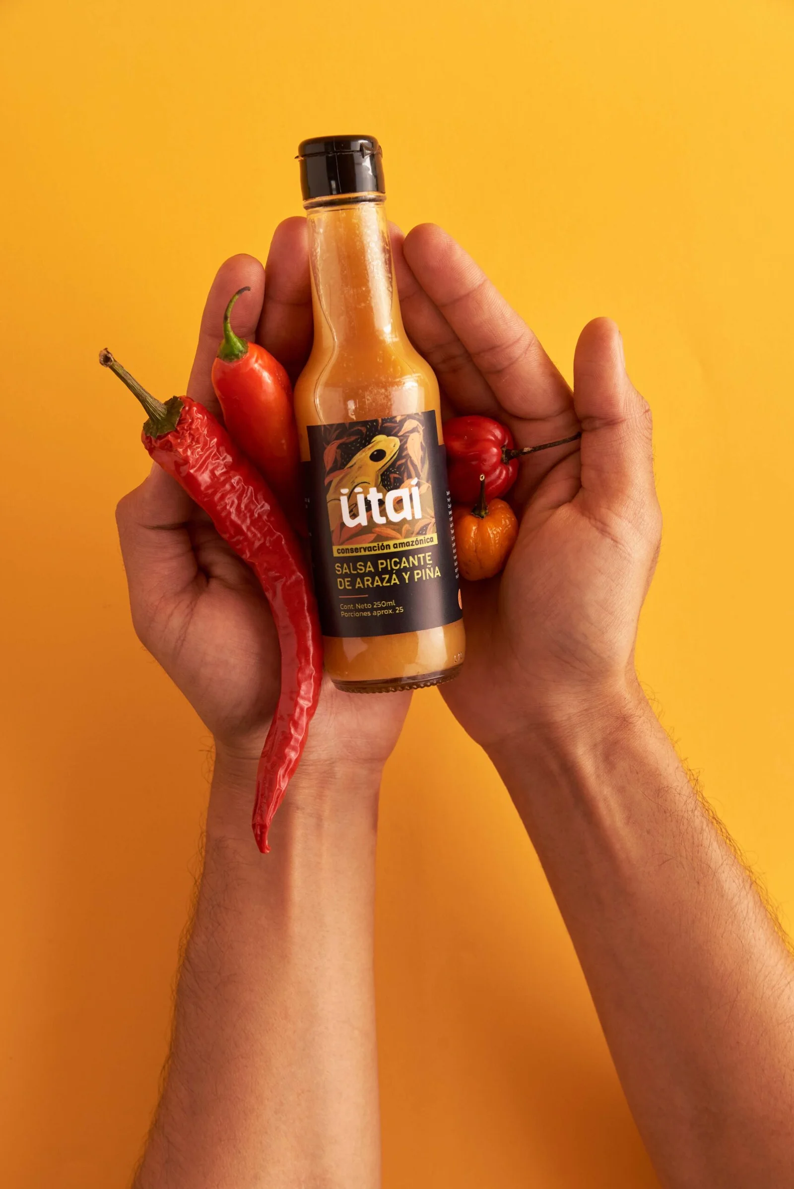
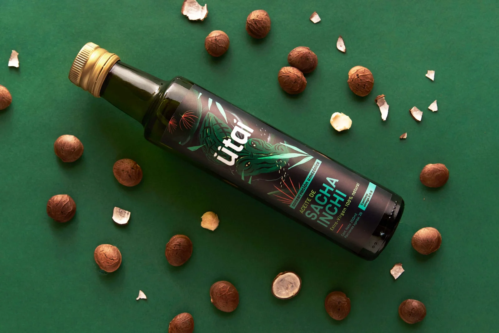
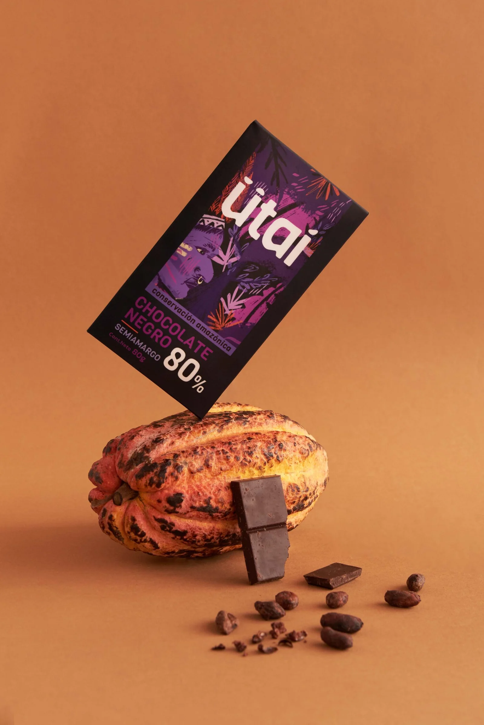
Once the name was chosen, we held creative sessions with the ImasD design team, drawing inspiration directly from the Amazon rainforest. We decided that the brand would always evoke Amazonian fauna and flora through handmade illustrations, rich in vibrant colors, which became the signature visual element of every package.
The outcome
The proposed packaging design offers great flexibility for expanding the product portfolio while maintaining brand consistency. Black and purple were chosen as the base colors of the brand identity, allowing the illustrations’ vivid colors to stand out powerfully—creating strong differentiation on shelves.
Ricardo Calderón, Executive Director of Agrosolidaria Florencia, shared that the packaging has fostered deep connections with consumers, making them feel closer to the brand. The designed identity has helped the community feel represented, reinforcing their sense of belonging. This has opened new growth opportunities for the brand.
As a result, revenues have increased by 50%, and the brand constantly receives partnership proposals from other organizations.
Research: Isabella Ortiz
Graphic Design: Manuela Martínez, Sandra Mora
Photography: Departamento de arte
Art Direction: Manuela Martínez, David Freyre
Creative Direction: David Freyre
