The challenge
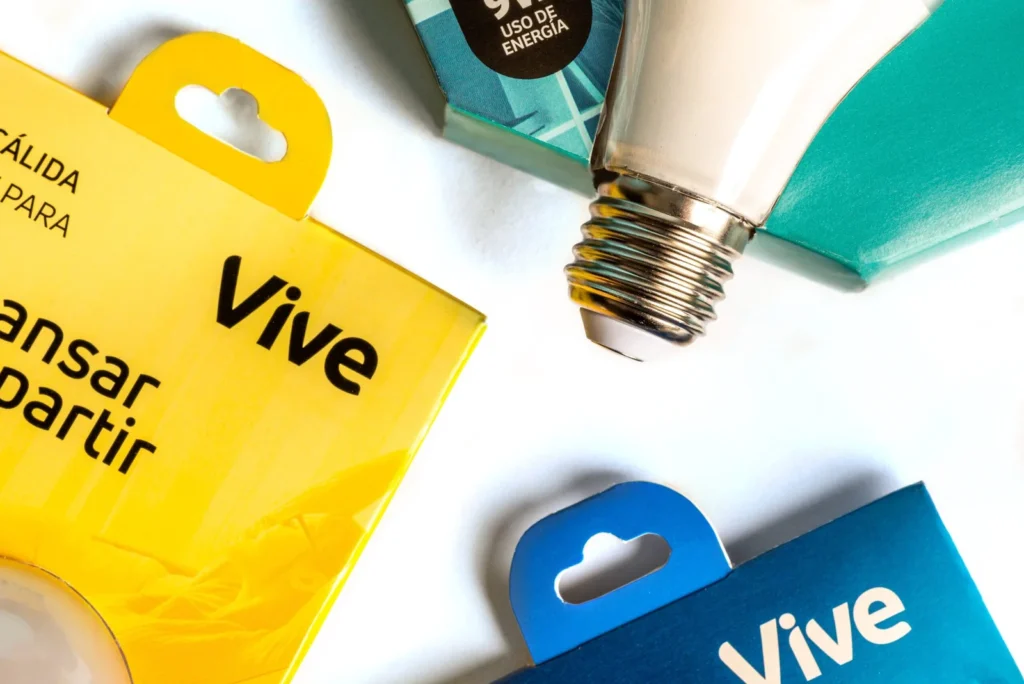
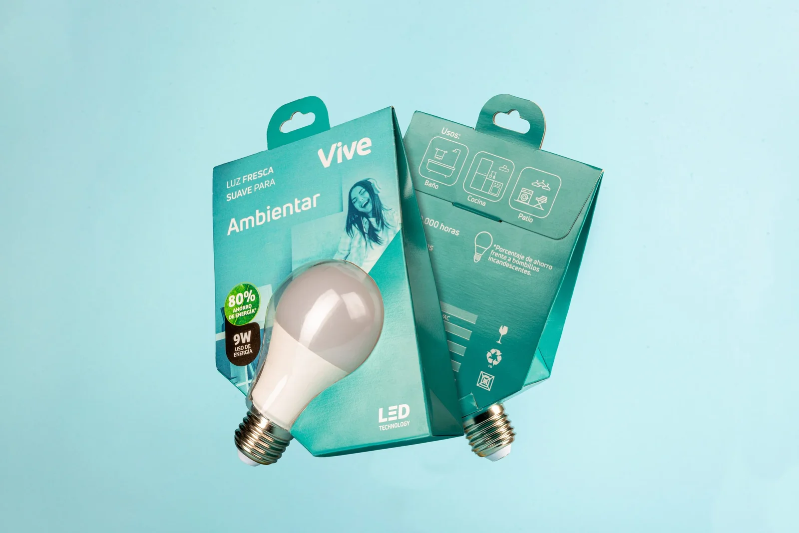
To redesign the graphic system and packaging of Vive’s LED light bulbs, which were previously marketed with complex technical communication. The goal was to create clear and coherent messaging, focusing on how users implement the bulbs in their daily lives and the benefits they provide.
What we did
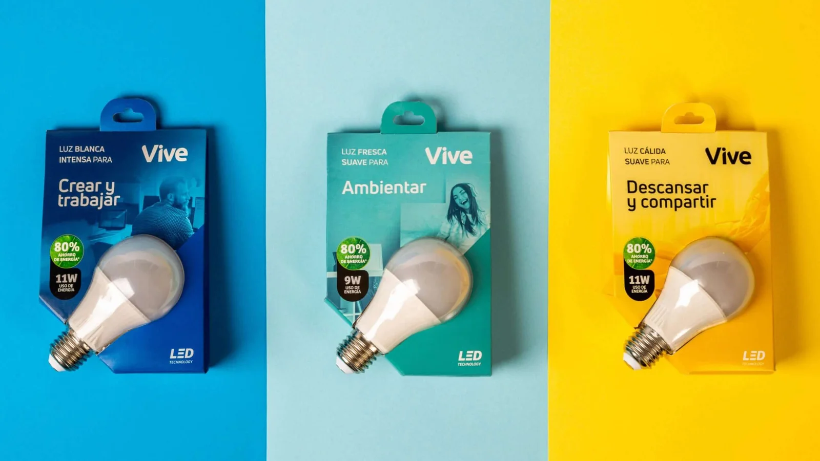
We simplified the entire purchasing process by developing a more approachable communication style. The technical terminology was translated into digestible information, ensuring that users could confidently select the right light bulb for their needs.
research
We focused on the user’s purchasing journey. One of the key insights we discovered was that buying light bulbs is rarely a planned decision. Instead, it is a corrective, urgent purchase, usually made when a light goes out—especially at home.
Through competitive analysis, we examined how other brands communicate functionality and found that many consumers struggle to understand the technical specifications (e.g., watts, lumens, efficiency, voltage, power, and light output).
Our research showed that users couldn’t translate technical specs into real benefits, leading us to develop a communication system that is both simple and practical—as direct as it is relatable.
Concept development
Once we identified the key research findings, we focused on educating consumers about LED bulbs—a superior alternative to traditional energy-saving glass bulbs.
A critical requirement that emerged during research was the need to showcase and test the product. This meant:
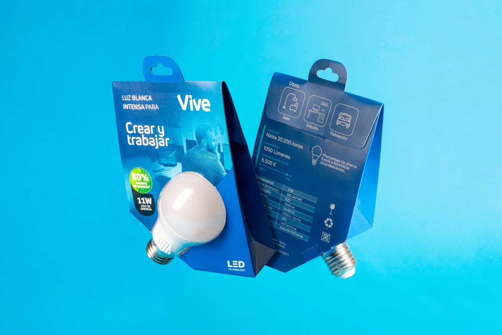
Displaying the plastic material of the LED bulb, demonstrating its durability and shatter resistance.
Allowing consumers to test the bulb in-store without needing to remove it from the package.
We also considered shelf placement in retail environments. Our mystery shopper research revealed that bulbs are either stacked upright on shelves or hung on display hooks. This insight guided the structural packaging design, ensuring adaptability to both retail formats.

The outcome
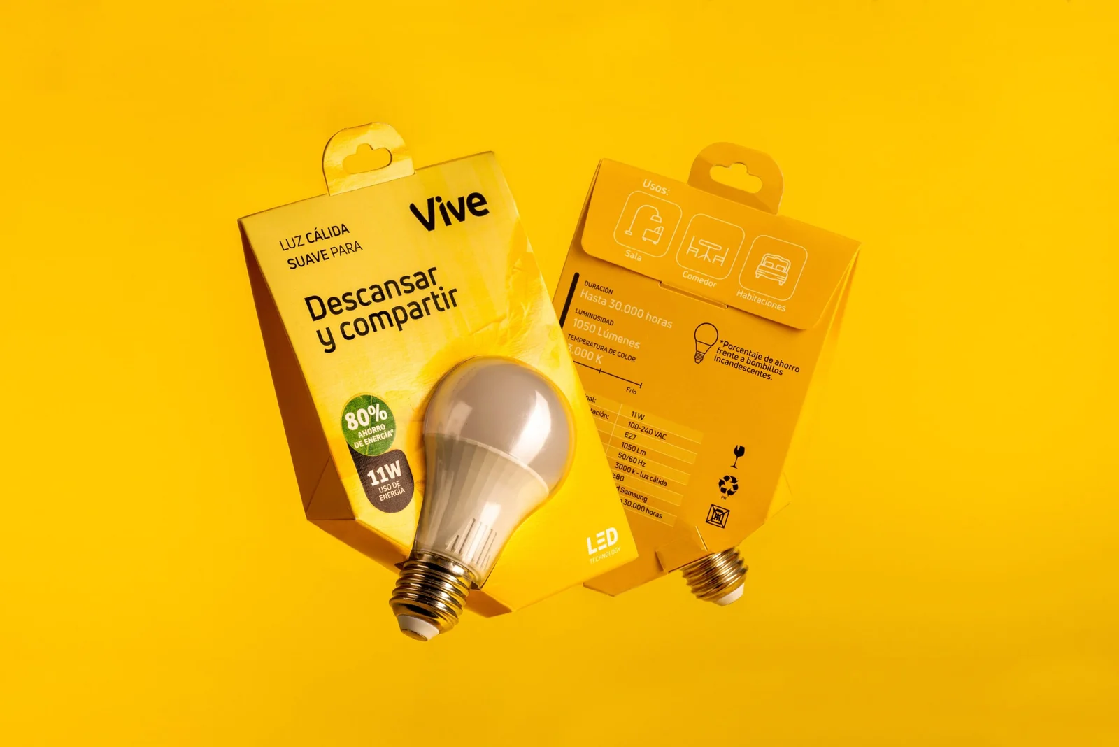
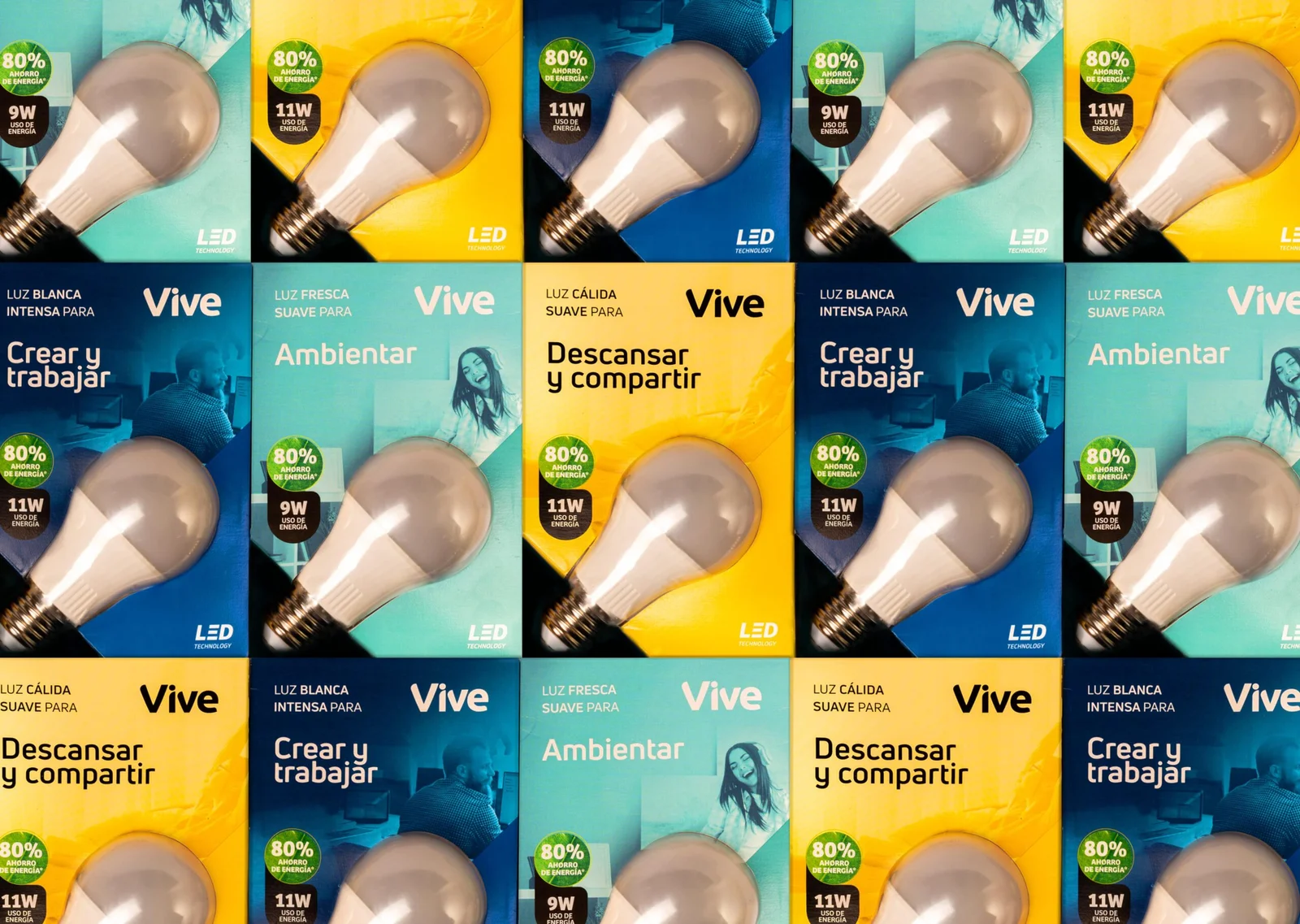
We designed a structurally and visually disruptive product that stands out in the competitive LED light bulb category.
During user validation, we found that some of the technical claims we initially removed were actually necessary for product comparison. However, we reintegrated them in a more user-friendly and digestible way, maintaining clarity without overwhelming consumers.
The final packaging design ensures that Vive’s LED bulbs are easy to understand, easy to compare, and easy to buy—ultimately creating a better shopping experience for consumers.
